PhD course - Better Data Visualization (using R)
On 14-15 February Ruben Berge Mathisen will hold a two-day workshop that provides an introduction to data visualization using R

Main content
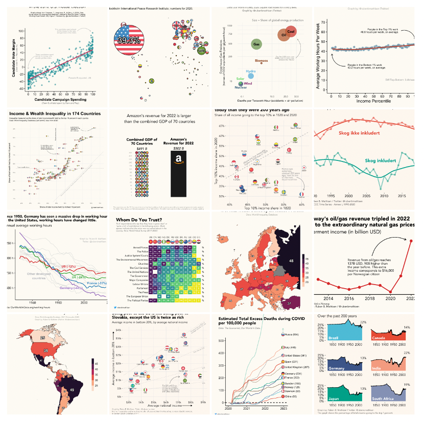
Data visualization can be a powerful way of telling stories with data. This course provides a guide for how to make informative and visually attractive charts both for scientific purposes and for research dissemination, using the R programming language. We will cover a variety of different techniques for improving our data visualizations, to go above and beyond the basics of lines, dots, and bars. In doing this, our aim is to make charts that make an impact, both in the academic community and the general public.
The course has two core components: Design and Implementation. In the design part, we will learn what distinguishes good charts from not-so-good charts, thereby identifying the key components we need to think about if we want to optimize our data visualization. In the implementation part, we will learn how to go from an idea to actually making the chart. We will mainly be using the ggplot-package in R, an extremely versatile tool that allows us to create (or recreate) virtually any graph we want.
The deadline for registering is 1 February and completed course participation gives 1 ECTS. PhD candidates, Postdocs and permanent staff are welcome to participate. The course is taught in-person in Bergen.